LaPerles
Overview
LaPerles is a small grocery store located in Colebrook, New Hampshire. The majority of their sales rely on customers that shop at their store in person, but they do offer online orders for pick up and delivery.
Shoppers at La Perles tend to live locally. They choose to buy groceries at LaPerles for the convenient location and out of loyalty to small businesses.
The problem LaPerles faces is they have had a decrease in volume of customers as well as sales revenue since covid 19 guidelines have been put into place. There has been an increase in online activity but a high bounce rate and only a slight increase in online sales.
Scope
Project Deliverables
Interactive Mid-Fidelity Prototype
Duration
2 Weeks
My Role
Research and Design
Tools
Figma
Process
Research
Heuristic Evaluation
I conducted a heuristic evaluation of the current site, the product browsing experience and the checkout process to determine usability. The overall score was low with the two major concerns being efficiency and error management.
Competitive Analysis: Feature Inventory
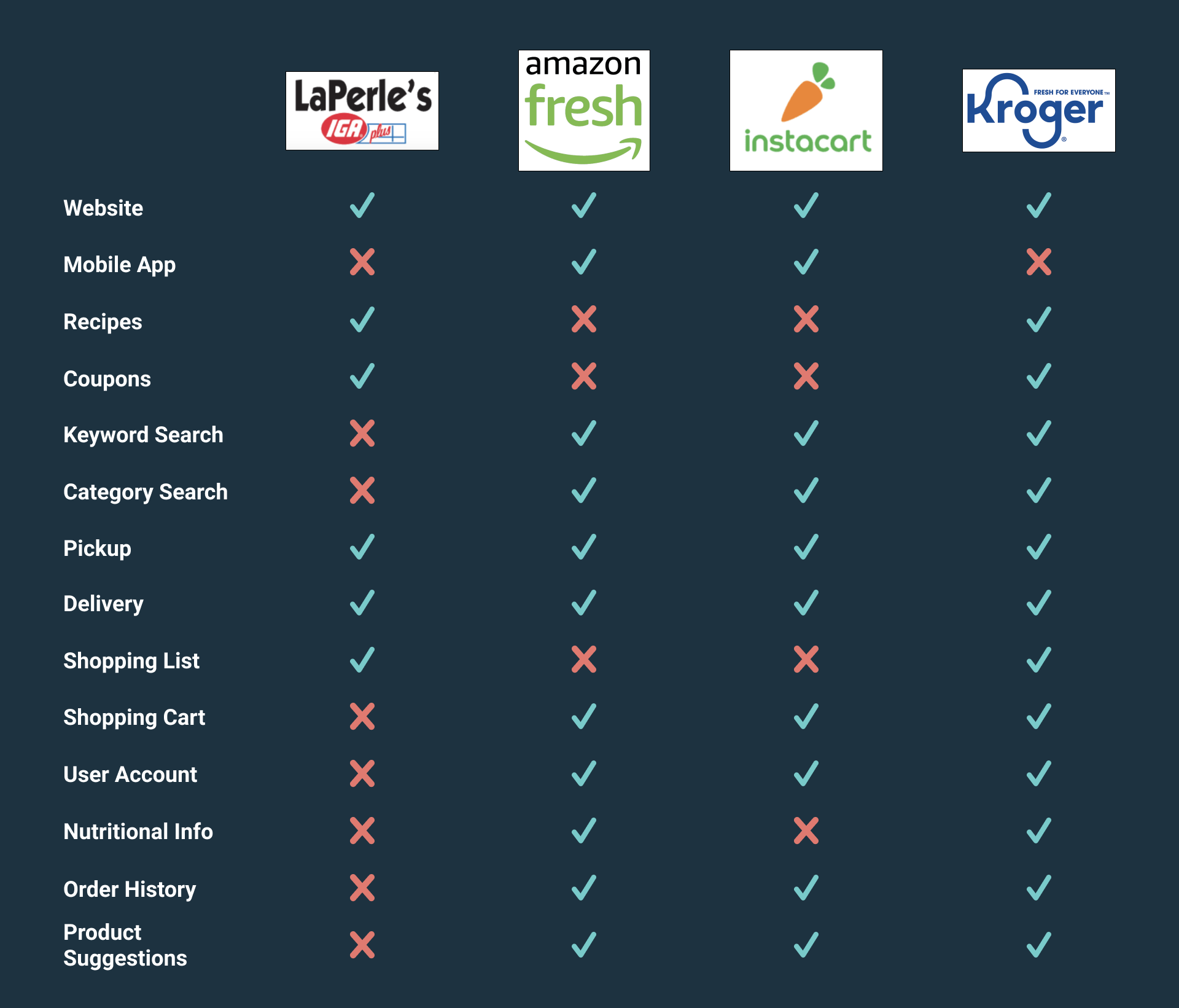
I compared the features on the LaPerles’ website to some direct competitors, to determine where they stood compared to the industry standard. I found LaPerles to be lacking in the most basic of features that users would expect in an online grocery shopping experience.
User Interviews
Conducting User interviews and synthesizing the data is my favorite part of the UX process. This step helped me to remove any assumptions and biases I had personally about the online grocery shopping experience and understand the users better. I interviewed 3 people between the ages of 25-35 living locally that frequently bought groceries online.
Synthesis
Affinity Map
I affinity mapped my initial interview takeaways to uncover patterns and commonalities.
User Persona
I found it valuable to create two types of user personas: one user that has a high level of confidence with technology and one user with a lower level of confidence. These helped me to empathize with the users when making design decisions.
Meet Kathleen
Kathleen is a single empty nester who works long hours and has a thriving social life. She dislikes taking the time to grocery shop on a weekly basis and would like to streamline the task by ordering her groceries online at her work desk. Her goal is to multitask and save time.
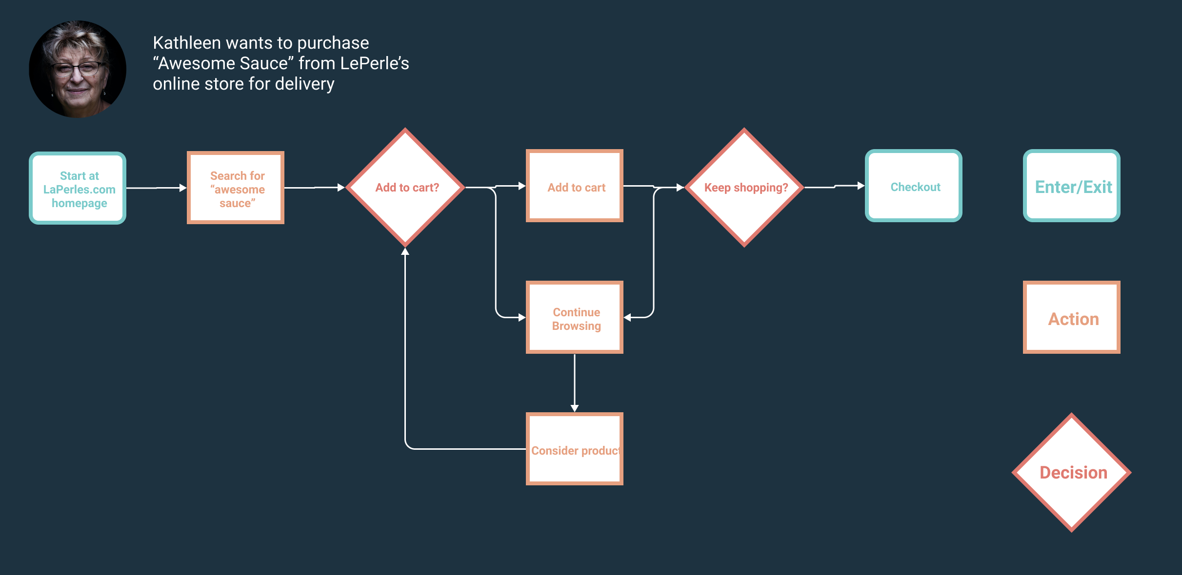
Kathleen need a better way of Browsing LaPerles available groceries on their website and purchasing them for delivery so that she can save time on this chore.
Meet Dori
Dori works remotely as a freelance graphic designer. She wants to order her groceries online to maintain social distancing, and she values shopping locally to support her local economy. She is excited when she learns she can order through LaPerles website, but quickly discouraged when she realizes how difficult it is.
Dori needs a better way to order her groceries from LaPerles so that she can support local businesses and maintain social distancing.
Journey Map
I created a journey map so that I could further understand the clients pain points and identify areas of opportunity, which included advertising specials to shoppers and providing recipes.
Ideate
Site Map
I ran a Card Sort using Optimal Sort with six users and a list of 50 grocery products sold at LaPerles. I used to results to create a site map, which maps out the architecture of the website.
User Flow
This step helped to identify how a user would move through the site when given a particular task. This would also be handy in the prototyping stage. More importantly it helps to identify which screens may be needed for the wireframes.
Hand Sketched Wireframes
Finally I was able to begin to brainstorm, hand sketching the first drafts of my wireframes, identifying which features should be included and experimenting with the user interface layout. I find this is an important step before digital wire framing to allow for a rough draft.
Design
Wireframes
From there I moved on to drafting my wireframes in Figma based on the insights I gained from my initial sketches. I designed for both hand held and desktop devices so that the site would flow seamlessly between both.
Home Page
I redesigned the homepage and tried to keep the design simple and informative for new users. I created a header that included a categories function and a search function to allow users to locate products they are looking for at any point during their experience on the site, as well as a link to their account profile and their shopping cart. I thought it was important to highlight promotions, sales, best sellers, and seasonal categories. I created a footer that had important information such as location, hours, contact info, and social media links. I also created the option to sign up for a weekly newsletter.
Search Results/ Category Landing
This page can be reached by selecting a specific category or by using the search bar. It features the products within each category. I thought it was important to be able to filter these products by brand and type, depending on what type of grocery item they are. I also thought it was important to be able to sort them by price, reviews, or “bestseller” status. I also included breadcrumbs as an easy way for users to navigate back to previous screens. The user has the option here to directly add products to their cart or click through the products to navigate to the product information page.
Product Information
The product page features images and information about individual products. I thought it was important to include nutritional information here when applicable because many users use this information to help determine if they will purchase a product. I also included user reviews and suggestions for similar products the customer might be interested in. here the user can select the product quantity, delivery or pickup, and add the product to the cart.
Shopping Cart Review
This is the first step in the checkout process where the user can review and edit their cart. They will be able to switch items between delivery and pickup if desired. From here they can begin to place their order by selecting “checkout”. They have the option to checkout as guests, or if they are a returning customer that created an account they can sign in, and all of their checkout information from their last order will be conveniently saved for them.
Checkout Page
If they are checking out as a guest for a delivery order, this is where they will put in their shipping address and payment information.
Iterate
Usability Testing
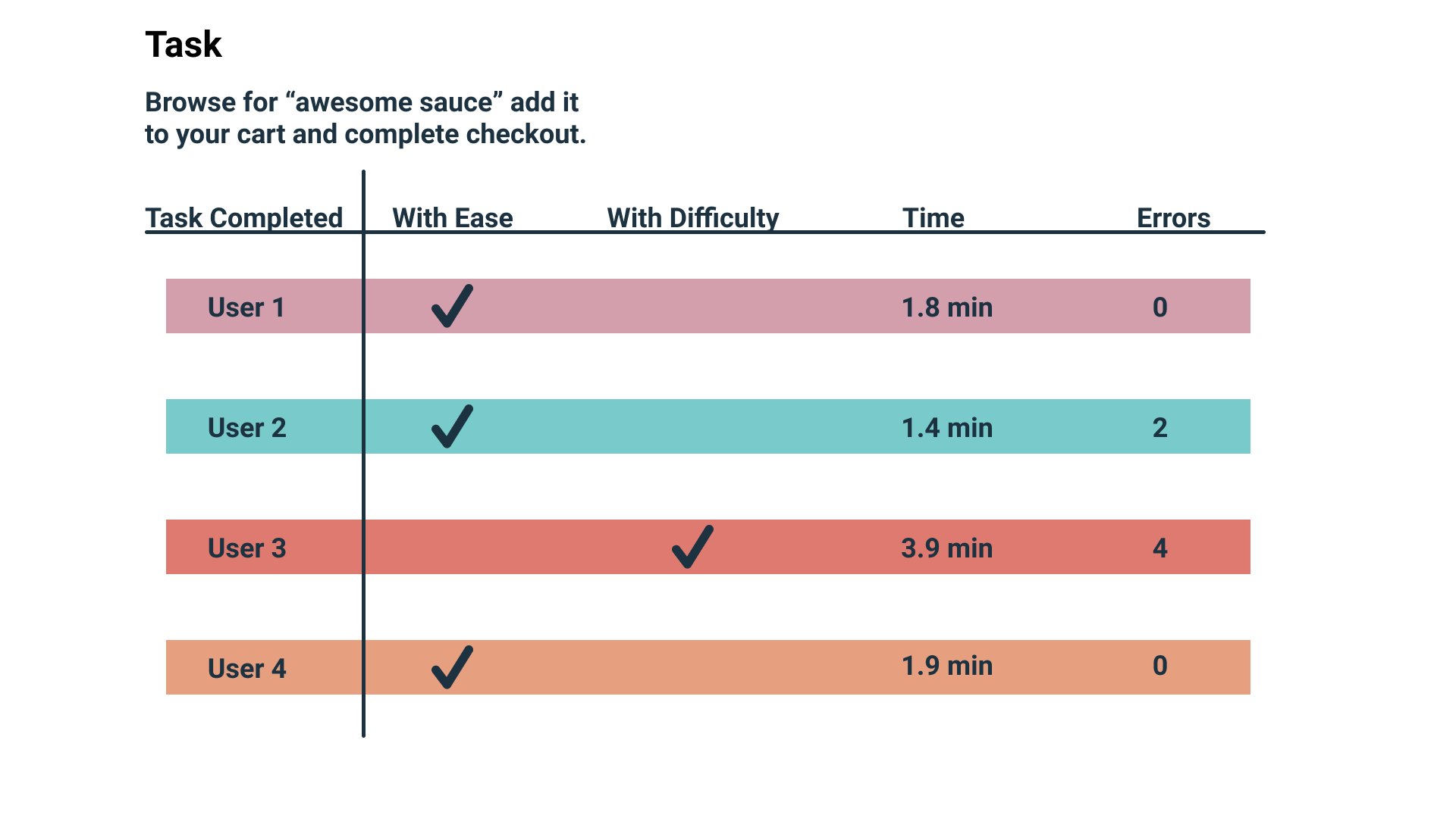
I conducted 4 usability tests asking the users to locate an item, add it to their cart, and checkout.
The results indicate that the is easily accomplished, but I did make some modifications based on feedback.
I included the ability to add items to the cart from the search landing/categories page.
I included a followup page after purchase had been complete that thanked the customer, provided important shipping information, and showcased discounted products.
Deliver
In my research I learned that no matter the motivation users had to shop for groceries online, for the extra money spent on the service they expected to spend less time shopping and experience greater convenience.
To optimize sales they needed to have methods to replace the experience of browsing for new brands and unknown products that they would have shopping in person, which includes product suggestions and methods to browse the catalog of all available products.
What I Learned
Next Steps
The next steps I would like to take would be to add features that creates that same community feeling that shopping LaPerles in person would have. For example a local events page or a page detailing the store’s history in the community.
I would also like to add in recipe content that includes links to the products featured.


