

Nextdoor
The Problem
Nextdoor is a company that wants to promote community interaction and engagement. However their reputation is that of a company that allows for some very unneighborly conduct. Many users that come to the app seeking a sense of community find content that does not interest or apply to them. Much worse some users find themselves alienated by content that is inflammatory, hostile, and toxic.
Scope

Project Deliverables
Interactive Hi-Fidelity Prototype
Duration
2 Weeks
My Role
UX Researcher and Designer on a 4 person team
Tools
Figma
Miro
Canva
Process
Research
User Interviews
Nextdoor has over 27 million monthly users spanning across 11 countries. Our first step into understanding the user experience on Nextdoor was to interview regular users and lead moderators to uncover both pain points and areas of opportunity. For the purpose of our study we spoke with US users, and created an interview outline that focused on which features drew users to Nextdoor, and how they felt about their overall experience with the service.
9 participants
Ages 25 - 65
Located across the United States
Affinity Map
We took notes from our interviews and affinity mapped them on Miro to locate patterns and areas of significance. We uncovered some commonalities in the Nextdoor experience.

Personas
We began to think of our problem in terms of two different types of users. The casual user who is using Nextdoor to connect with their community, and the volunteer moderators or “leads” that moderate the content posted to next door.

Sara Miller
Sara primarily uses Nextdoor as a way to keep up with her local community in regards to information on what might be happening within her neighborhood. She experiences frustrations with the app sometimes because of posts that are not within her immediate neighborhood. She is annoyed by the amount of non-relevant information within Nextdoor, and wants an easier way to view relevant posts to her within her immediate neighborhood.
More troubling, she oftentimes would see posts containing racial profiling or have political agendas that disrupt the sense of community. This drives her away from using the app altogether.
Ken Burns
Ken is a lead for nextdoor. He took on the roll with excitement, to be of service to his community and help them follow the community guidelines. Over time the amount of notifictions he received and the time he was expected to spend moderating the neighborhood began to overwhelm him. He found himself avoiding the task altogether leaving his community without leadership.

Journey Maps
I created retrospective journey maps to uncover opportunities and understand how both casual users and moderators move through the current version of the Nextdoor app.


Design
User Flow
The first step to redesigning the app was to create a user flow that walked through the steps a user might take when interacting with the app. This step also helps to identify necessary screens. In this case we found it important to determine how both the casual user and the moderators interact with the app.

Wire Frames
As a team we created the wireframes collaboratively on Figma. Once we understood the issues from both the point of view of casual users and leads, we realized we needed to solve the problem in two ways: make it easier for users to filter and sort content on their feed, and make it easier for leads to keep up with their voluntary duties.
User Interface
We added a filter feature that enabled users to filter content both by subject matter and by their desired local area. We also made leads easier to identify and correspond with.


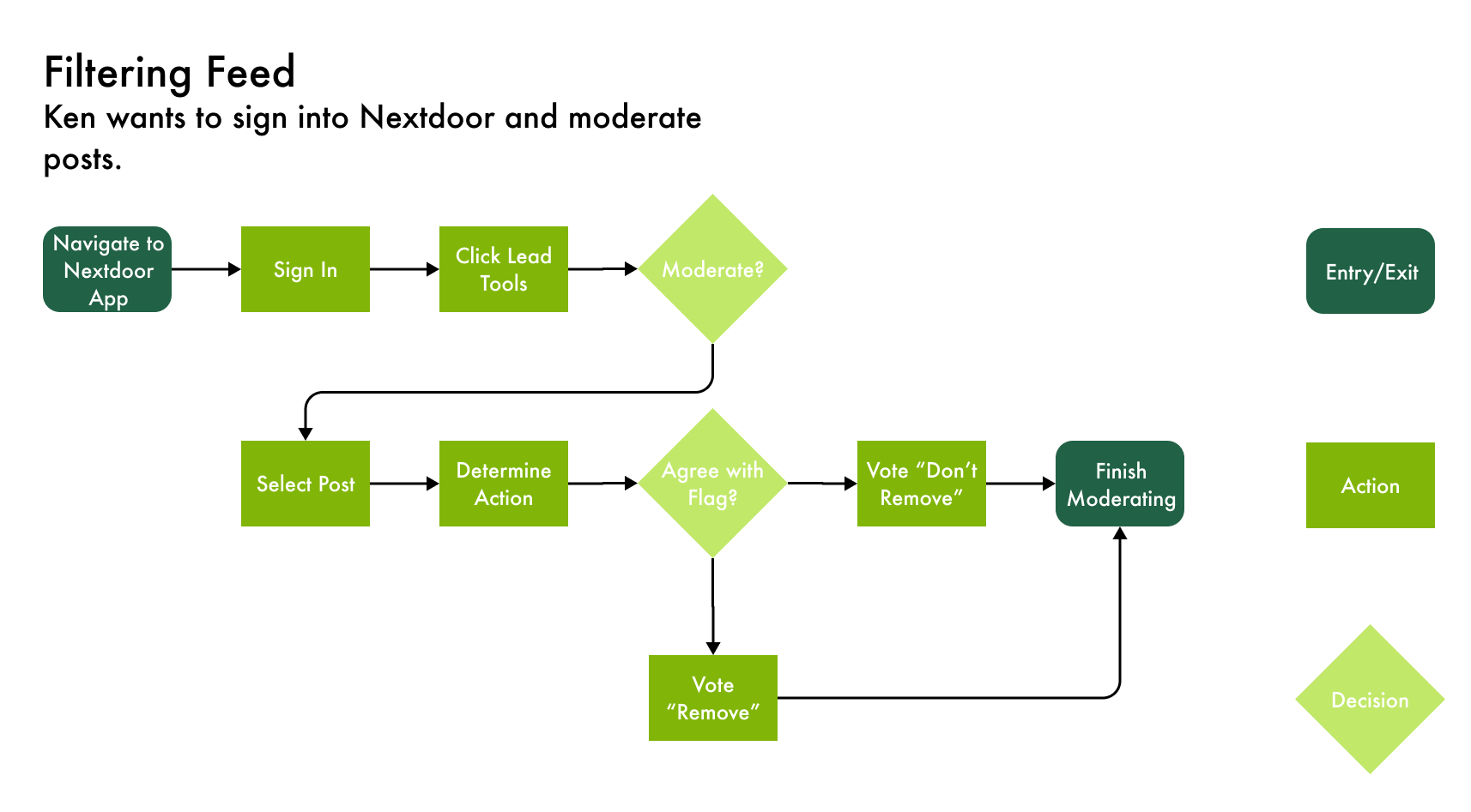
Lead Interface
This interface we built from scratch as Nextdoor did not have a lead interface for mobile devices. The thought process here was that allowing leads too moderate from their mobile device will inspire them to tend to their moderator duties more frequently. We also gave them the option to filter their messages between personal correspondence and messages regarding lead duties.


Evaluate
User Testing
We created a clickable medium fidelity prototype using Figma, and began usability testing. We tested on 5 user with the following tasks:
For the User Interface
Identify multiple means of selectively screening or filtering content
Find a way to get in contact with your neighborhood leads
For the Lead Interface
Find and evaluate a flagged post
Respond to a message from a user

What We Learned
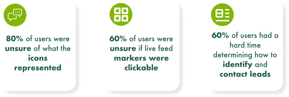
From our testing we determined that users had a hard time identifying what individual icons meant, and so we added labels. They also had a hard time determining whether or not live feed markers were clickable so we made their button status more obvious. Lastly they wanted to be able to contact leads directly from their personal messages so we created this capability.
Testing for the lead interface went smoothly but we decided to make voting features more obvious.
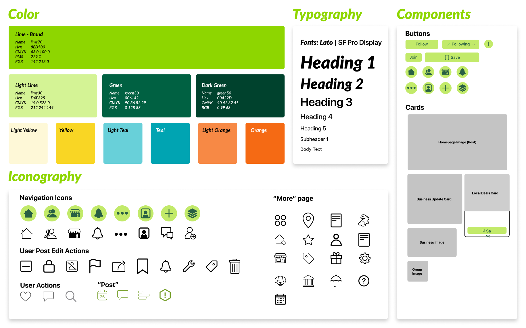
Design System
As we designed the screens collaboratively, we determined that it was necessary to create a design system that standardized our repeatable components, streamlining our design process.
Deliver - Final Mockups
User Interface


Lead Interface


Next Steps
Additional features could include
A more comprehensive onboarding experience for new leads
Supplemental lead training materials
Creating more subject categories to allow for more refined filtering
Allowing users to define the exact boundaries of their neighborhood
Direct Support for leads from Nextdoor